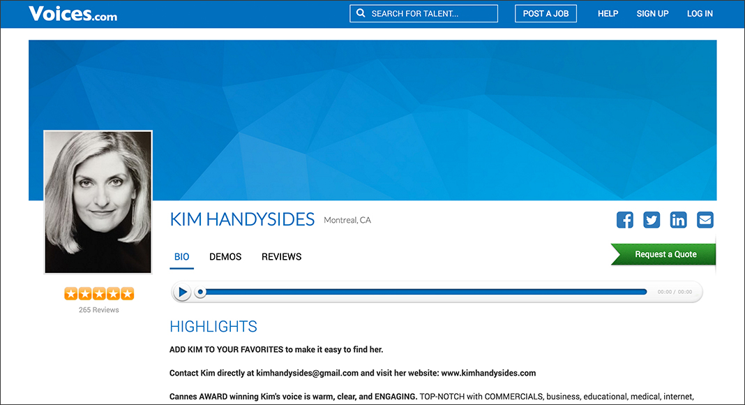
We’re giving voice talent profiles and audio players a fresh, new look! In time, you’ll be able to personalize your Voices profile, choosing from a menu of options sure to complement and impress. Learn more in today’s post.
First Impressions
You know what they say about putting your best foot forward. Coming soon, you’ll be able to put a new polish on your profile at Voices with cover images. This is exciting to be sure, and something else you’ll want to consider is how this enhancement to your profile affects the image you chose to include on your profile.
If you have a photo uploaded already, you’re going to want to see how it looks on the live site. You can do this by visiting your profile. All Voices voice actor profiles have the same URL structure.
To see your profile, either click on a link to do so within your account or copy and customize the following link:
https://www.voices.com/people/yourusername
Looking for some hot tips to make your profile picture look awesome?
1) Use Square Images
Why do this? The image you upload will be cropped into a square in the exact middle. If your photo is too tall vertically or too wide horizontally, it will not look the same when uploaded.
The best option is to upload an image that is already a perfect square or as close as you can get it to a square.
We can’t stress having a square image enough! In many places around the site (like Search results or the Top 100 lists) the image you upload will be padded or cropped into a square. If your photo is too tall vertically or too wide horizontally, it will not look the same when presented in these places.
2) Stick To Just Your Image
To get the absolute best result, simply upload a photo that doesn’t have extra space around it. You might be tempted to make a vertical image wider by increasing the size of the canvas but don’t. It will make your photo smaller and take away from what people are supposed to be focused on…you!
3) Stay Away From Landscape and Portrait View
Related to the first point (and the second!), using photos taken in either one of these presentations (landscape or portrait) will distort your image and as a result, make it appear differently on your profile.
If your photo is in landscape, your image will be “letter-boxed” by adding enough black padding around the image to make it into a square. If it is in portrait, the top and bottom of the image will be cropped into a square.
What Else is Changing?
You’ll also notice that the audio players on the site have gone from a grayish colour to more of a white. The blue looks really great! Another feature that has been added to the audio player is a way to see the duration of a demo.
To best take advantage of the newly added cover image and prepare for subsequent profile updates, upload a square image to your profile now.
Take care,
Stephanie

Leave a Reply